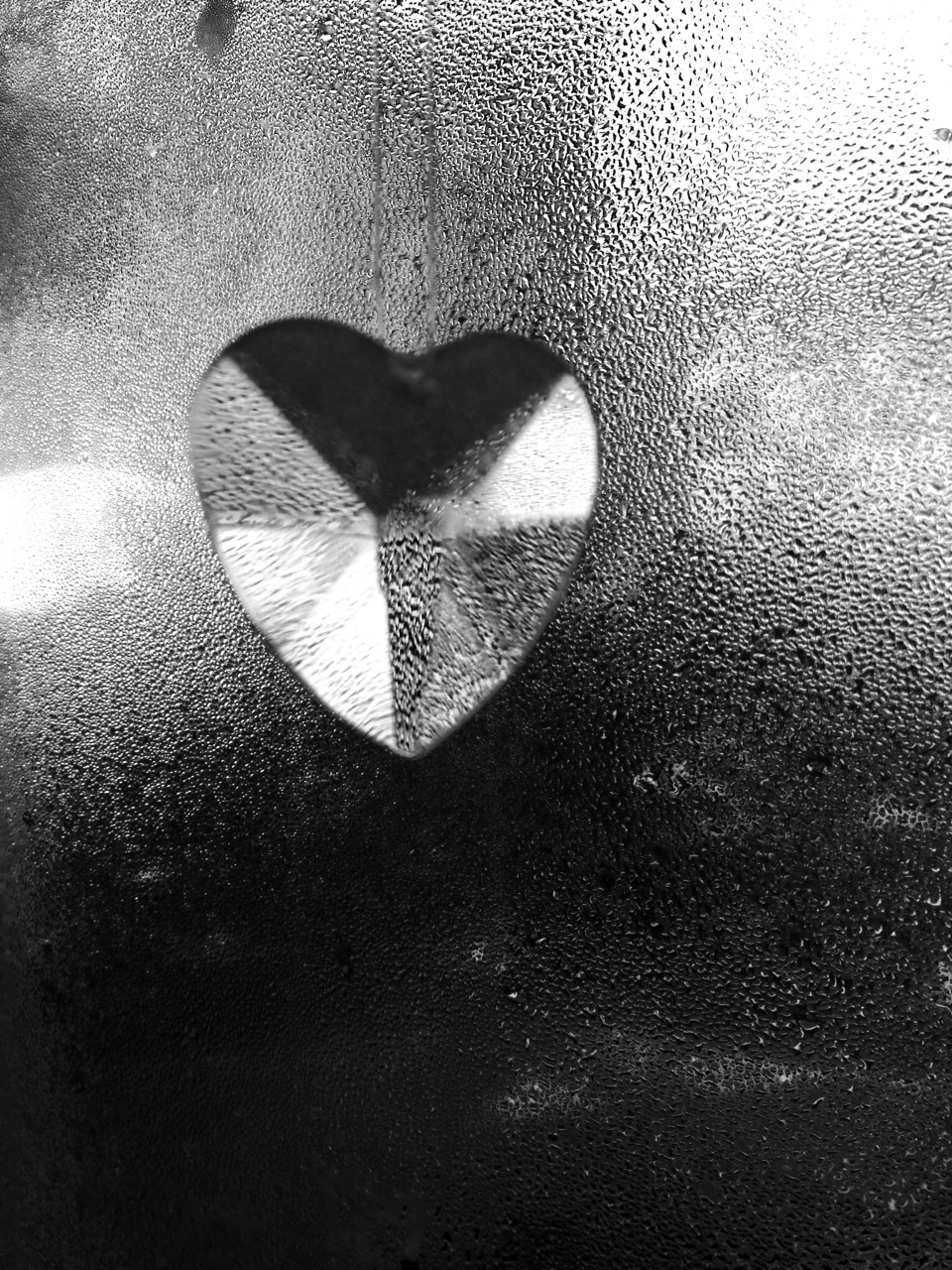


This week Lens and Pens asked us to consider how phones and tablets are changing the art form of photography. I have used two typical dinning out photos, that so many of us take. and transformed them into black and whites to see if they can become artful. I played with the idea of what do you love by starting with the crystal heart.
Today I know ask you, not which you like, but which picture do you spend more time looking at and why? Which I guess might be the same as like.
Sally also had a link to this video of 20th century Black and White Photography for all of us Black and White Lovers
. Happy Monday.
Here are other entries for this week’s challenge:
http://sustainabilitea.wordpress.com/2014/02/17/phoneography-challenge-black-and-white-3/
http://pictograf.wordpress.com/2014/02/17/iphoneography-black-and-white-2/
http://weliveinaflat.com/blog/panorama-shot-using-galaxy-note-3/
http://completelydisappear.wordpress.com/2014/02/17/the-beginning-of-the-end/
http://streetsofsfphotos.com/2014/02/17/paints-in-black-white-and-color/
http://livingwithmyancestors.wordpress.com/2014/02/17/phoneography-challenge-black-white-2/
http://pilotfishblog.com/2014/02/17/phoneography-challenge-a-black-and-white-tale-of-love/
http://fontsandfrosting.wordpress.com/2014/02/17/phoneography-challenge-black-white/

Hi! I really l like the textures in the crystal heart. It makes me want to return to that image again and again.
LikeLike
Thank you Patricia. Good feed back.
LikeLike
I look at the crystal heart the longest. It almost looks like it’s against skin, not glass, and the different tones of the facets are really nice.
LikeLike
Gee Ann you don’t like 3 😉 Skin interesting image I didn’t see that thanks.
LikeLike
Yes, the first image is fully engaging, especially because the backdrop drops an element of mystery and even surreal touch to the heart–also mysterious and surreal. Happy Phoneography Monday.
LikeLike
I am learning a lesson here for sure. I quickly shot te crystal this morning to add to the challenge. I did choose this image because of how the background merged with the heart. thanks for the feed back.
LikeLike
I have to go with the first one, too.
janet
LikeLike
the first capture is great. nice work
LikeLike
Aw another heart vote 🙂
LikeLike
I love the first one too. It almost looks like the heart is on a leather texture…
LikeLike
I relate to all three. The first one reminds me of when I used to take unusual picturres like that. The second one reminds me of the “olden days” when I was young. The third reminds me of the relatives I used to try and get a picture of. lol
So over-all, I like the second one.
Neal
LikeLike
well thought out reviews of each, Neal, The kiss was fun. The 1Phone lets me take a series so I can catch nice moments. A kiss or a “don’t shoot.
Practice with your phone around the house. the Heart is just hanging in my window 🙂
LikeLike
All three are effective in black and white. Originally I kept going back to number one because I was trying to ‘figure it out’. but I’m pretty fond of the third shot. I don’t think it would be as interesting in color, but the b&w add a timelessness to it. It becomes the iconic ‘don’t take a pic of me’ pic!
LikeLike
I’m so glad you see that iconic look of 3 that is what I was going for especially after watching the video of classic 20th century photography. The first one would be a nice greeting card.
LikeLike
Love the crystal hear, Carol; just the right balance of dark and light plus some beautiful moisture drops – lovely! I like the bus kiss too, a great “street” candid shot 🙂
LikeLike
I just printed out the heart and it kept it’s sparkle, a lot of iPhone pics don’t look so good printed… The kiss does look like bus capture. It was sweet friends of my daughter’s during dinner.
LikeLike